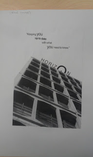
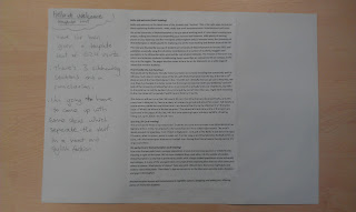
Here shows my 3 final pieces of work; cover, hello and welcome and my zine.
Raif Milne's Portfolio
Graphic Communication Student at Wolverhampton University
Tuesday, 13 December 2011
4VC003 - 'Where we are' (part 2) 'Horizon Cover'

This shows my final cover page to the project. I was happy with the outcome.
3. Prototype design
Here i'm drawing out the design I want to create (left) and then creating the prototype in photoshop (right). I realised that there was still things I needed to change to the design; such as the 'o' in horizon, making it larger and turning it into a semi circle so it looked like a sunset over the building, like a horizon.
2. Ideas
I designed 4 ideas and took the best bits from each one. My favourite idea was idea 1. I decided to progress on from that idea.
1. Selecting an image
Out of these 3 images I photographed, I picked the left image because I thought it looked the best and would work the best with my cover page.
4VC003 - 'Where we are' (part 2) 'hello and welcome'
4. 'Hello and Welcome' Final Print
For the final print, I changed the ampersand's contrast so it was a lighter black and changed the font of the 'welcome' title, to reinforce welcoming the reader. I boldened the quote so it stood out more and added photos too fill space and make the dps more interesting and professional. Overall I was happy with this final print.
3. Dps protoype
Here I've taken all 4 things I liked from my initial ideas and produced this prototype.
This is the printed prototype. There were lots of things I noticed needed doing straight away; such as adding imagery and making the sub heading italic.
2. The Idea process
Here I've split up an A3 page into 4 dps's. Each one has different layouts and designs, I've looked at all 4 and analysed which bits of all 4 I like and going to use in the prototype print.
1. Template Text 'Hello and Welcome'
I've been given a template file of already written work. All I need to do is tranform this file into an interesting and stylish dps.
Now that I have created my own zine for the magazine, I must now create a welcome page and a cover page.
4VC003 - 'Where we are' (part 1)
5. Final dps
This shows that I have reduced the amount of words I'm going to use in my dps. this apge explains what I've done and why.
This is my final drawn up idea, with the imagery and text placed in order and the title moved to the top of the left of the page.
I was ok with this print but I knew I could do better. I decided to rearrange the fonts and enlarge the images off of the page.
In my final print, I changed the subheading from regular to italic; making it more professional looking. I made sure that no text was hyphenated and no word stood on a line on its own. I added some extra text and an image to the bottom right of the dps to fill in some space and make the overall thing classy and good.
4. 2 prototype dps's
Here I've drawn out too prototypes and have noted what fonts and sizes I want for each one. I have drawn out where I would like imagery to be.
Prototype 1: I've analysed this dps and conluded that I should reduce the amount of words I have and also include fewer images.
Prototype 2: I tried out a simple design to see if it would work. But I wasn't satisfied with this dps, so I scrapped this idea of a dps completely.
3. Creating idea thumbnails
Here I'm changing up the A3 page into 4 smaller dps's. I created 4 different designs and took bits from each one that I liked and used them to progress to my 2 prototype dps's.
2. Inserting text and finding the right fonts
I'm inserting the first orginal text I wrote, to analyse what I have wrote.
I'm going through all the different fonts on indesign and word and seeing which one I think will work best on my dps. I thought the best way to see each font was by showing what each font looked like in regular, bold and italic. I ended up using Times New Roman regular for my main texts.
1. Researching Wolverhampton
I went around Wolverhampton and took photos of all the clubs, pubs and bars in the city.
Subscribe to:
Posts (Atom)


